 |
| Still from Swan's HBO Axios Trump Interview |
Got to love the look on his face. If you need or want the most excellent summary ever, go read your Wonkette. You should be anyway.
I noticed that no one has provided these charts for us. What?
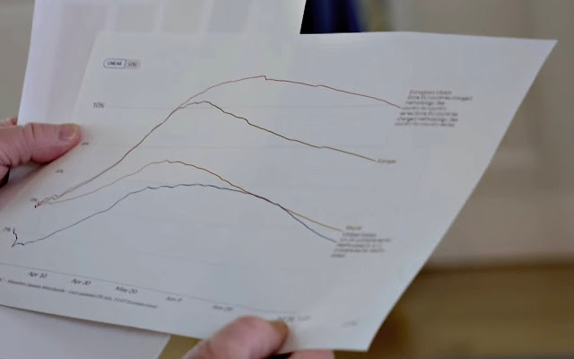
One Redditor recreated one chart for a hot second, but then took it down. I wonder why? Hoping that by doing so I was not disregarding some warning, I forged ahead, & after carefully picking stills from the interview, did my best with the un-sharp mask thingy & the radius & the unwarp & what have you. Here is what I got.
I found if you stand back a little the text becomes rather easy to read.
 |
| COVID-19 Deaths Per Cases (Not Per Capita) |
 |
| Trump Axios Linear Line Chart (2): COVID-19 Deaths 4/1?-7/1? 2020 Per Case (Not Capita) |
 |
| Trump Axios Linear Line Chart (3): COVID-19 Deaths 4/1?-7/1? 2020 Per Case (Not Capita) : Fun with Photoshop |
Hope it helps. Here's to fruitful debate!
Be seeing you.


No comments:
Post a Comment